


Tuned
In-App Magazine · Mobile
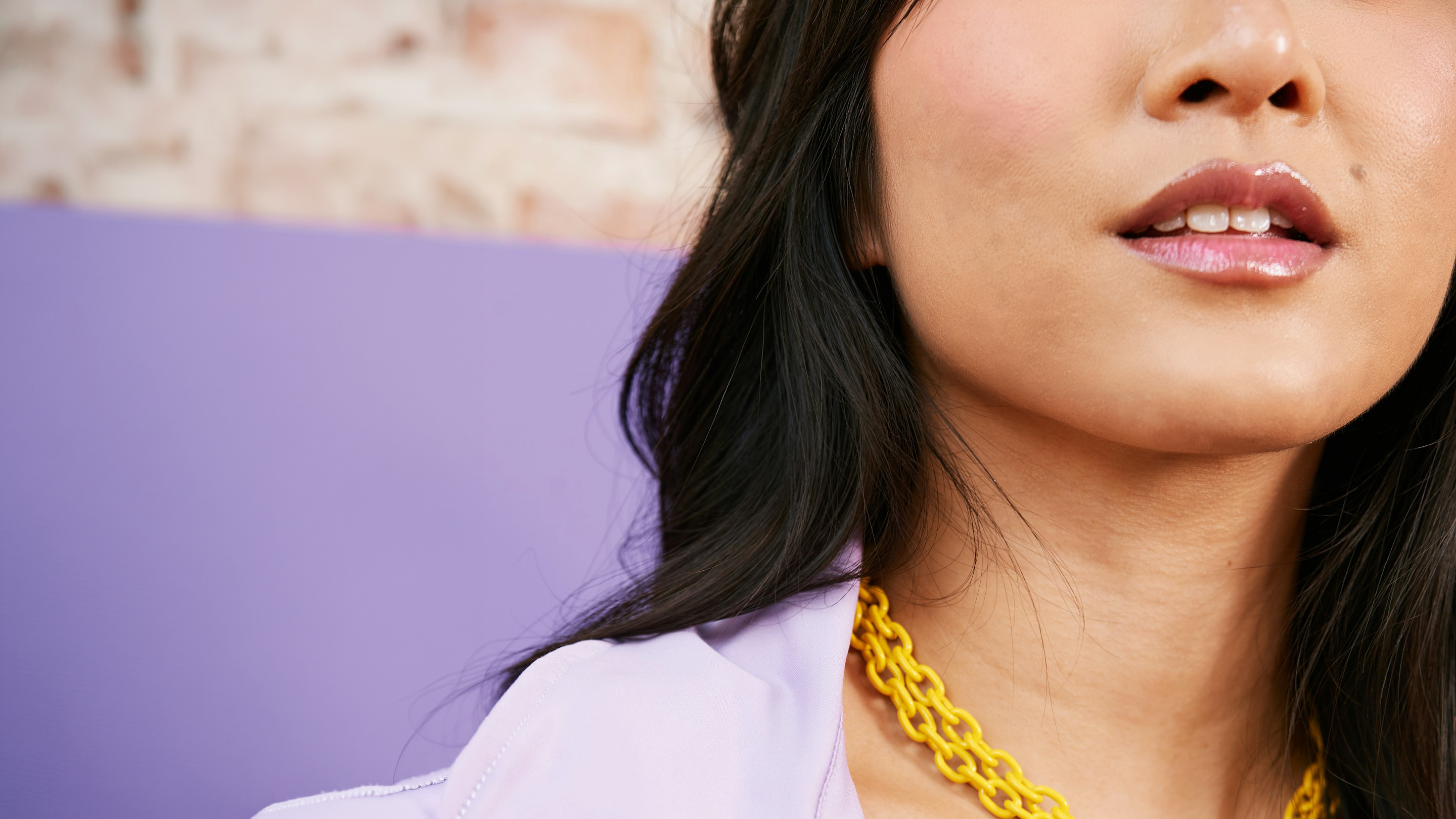
Tuned is an in-app magazine created for Facetune, a Lightricks app for face retouching and photo enhancement. It speaks to users who care about beauty trends, pop culture, and the craft behind successful social presence.
Leveraging Facetune’s reach, the project reframes product education through an editorial lens, positioning Tuned as a cultural layer within the app, combining curated, trend-driven content with opportunities for discovery, habit-building, and deeper engagement.
Brief
Introduce a cultural and editorial layer within the product, balancing inspiration, storytelling, and product education.
Role
Led the design team, defined the brand strategy and visual identity, and designed the brand mark and logotype.
Outcome
A recognizable editorial framework that integrates content into the product, supporting ongoing engagement and repeat interaction.

Symbol & Logotype
/
Logo

The symbol adapts the original Facetune logo with a fresh, approachable feel. The logotype retains the core brand typeface.
Euclid Circular B
Aa
Aa
The typography system is built around the dialogue between two contrasting typefaces.
A clean sans-serif typeface is used for body text and UI moments, prioritizing clarity and readability while keeping the experience fresh, modern, and accessible.
Tiempos Headline
Aa
Aa
A serif typeface is introduced for headlines and key moments, bringing a subtle magazine sensibility and a sense of character.
Together, the two typefaces create a balanced typographic voice; classic yet contemporary, supporting Tuned’s editorial tone without feeling heavy or formal.
→→→
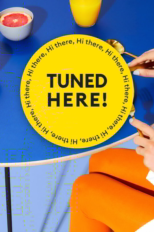

stay tuned for more


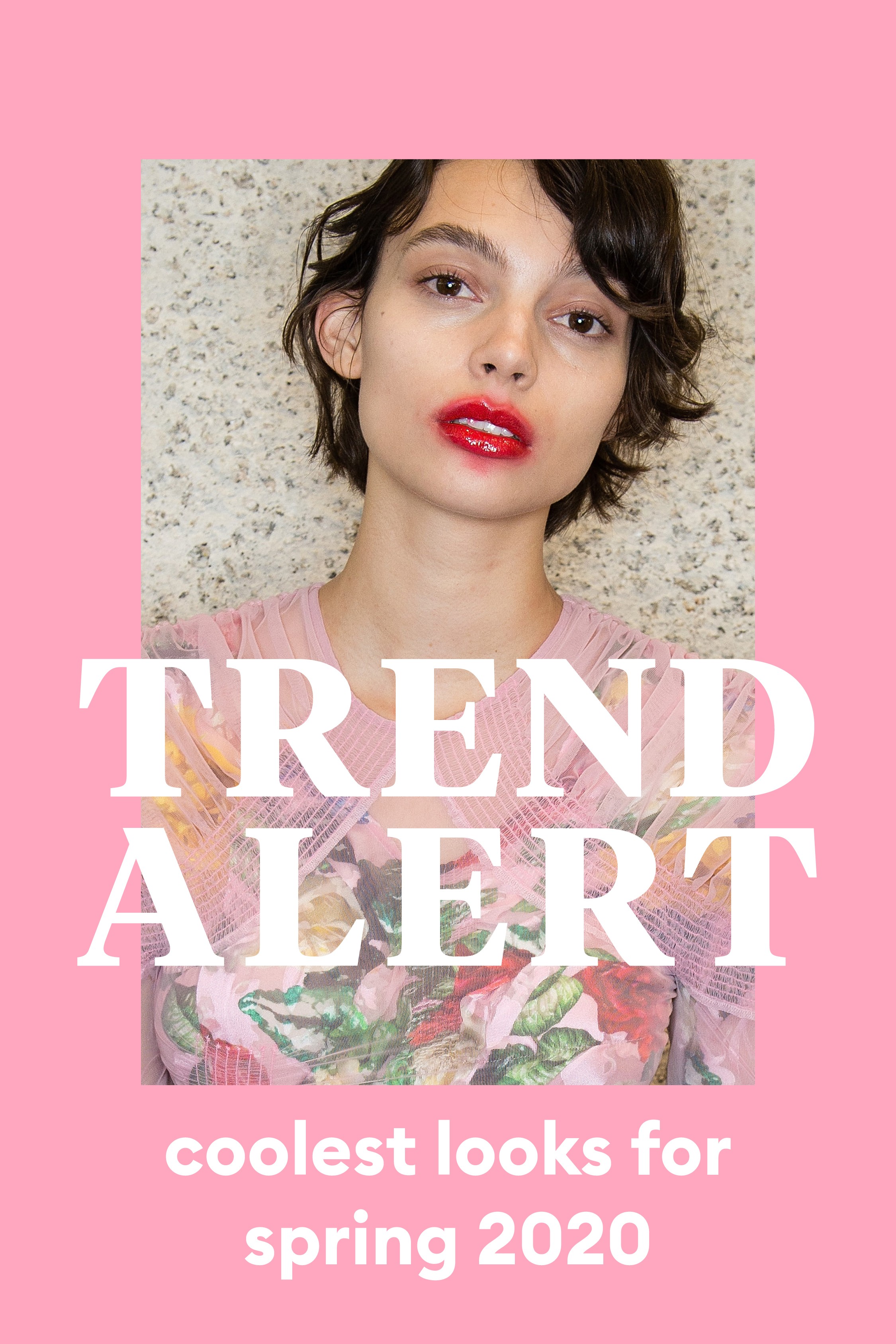
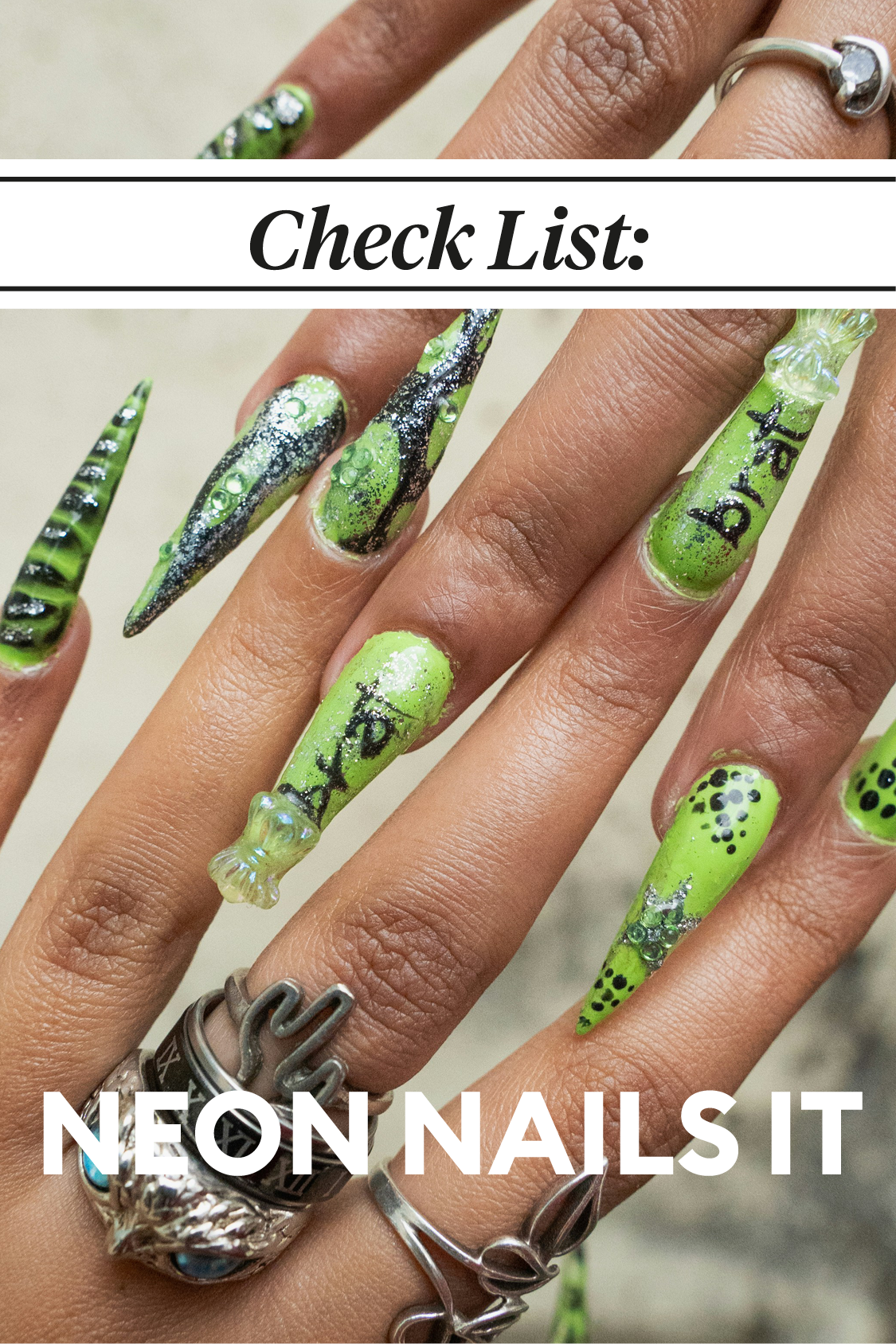
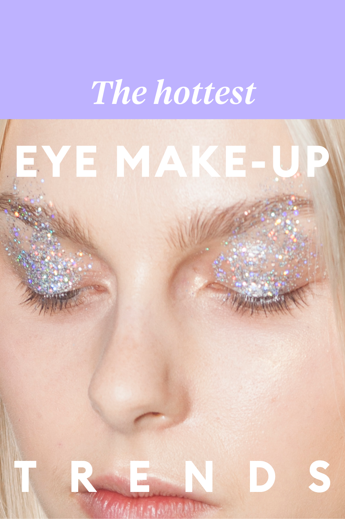
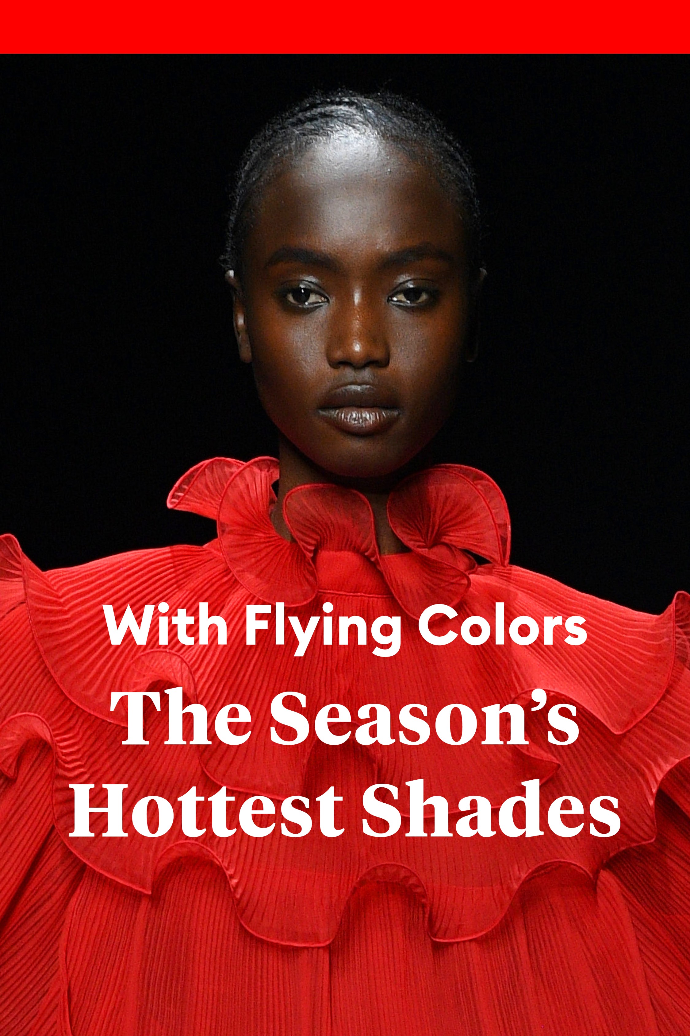
Formats
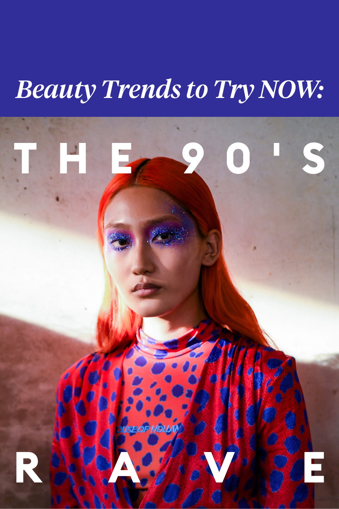
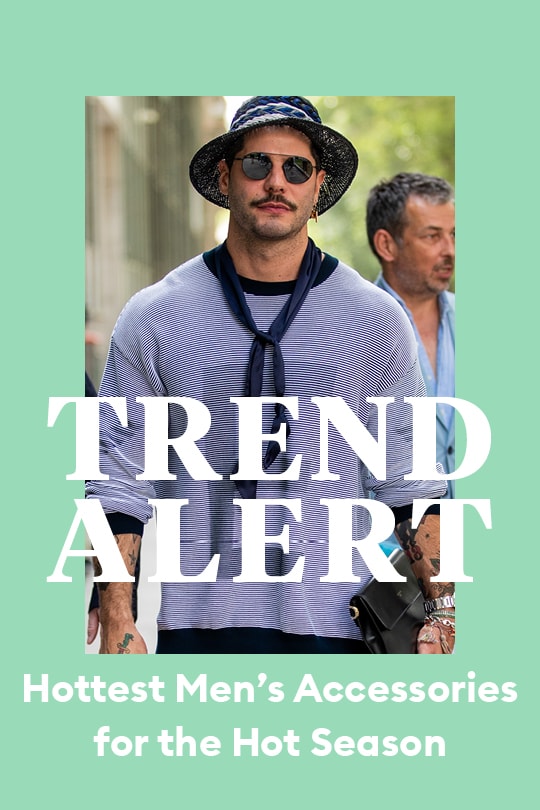
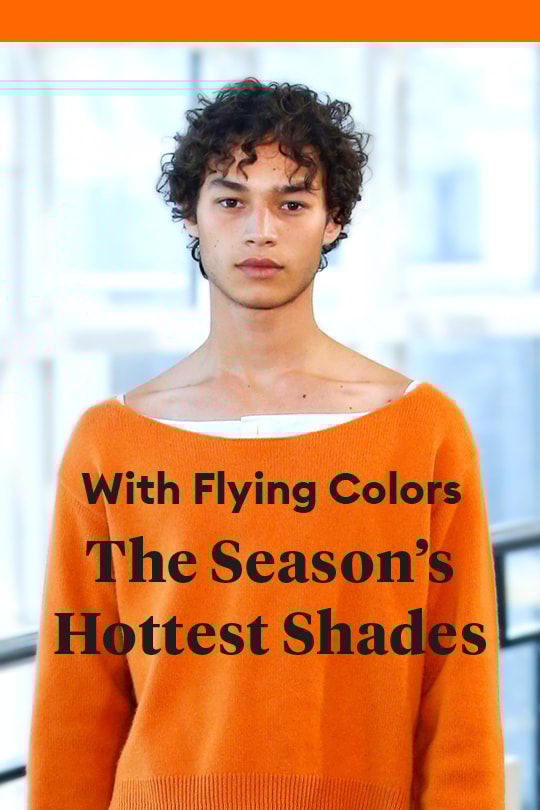
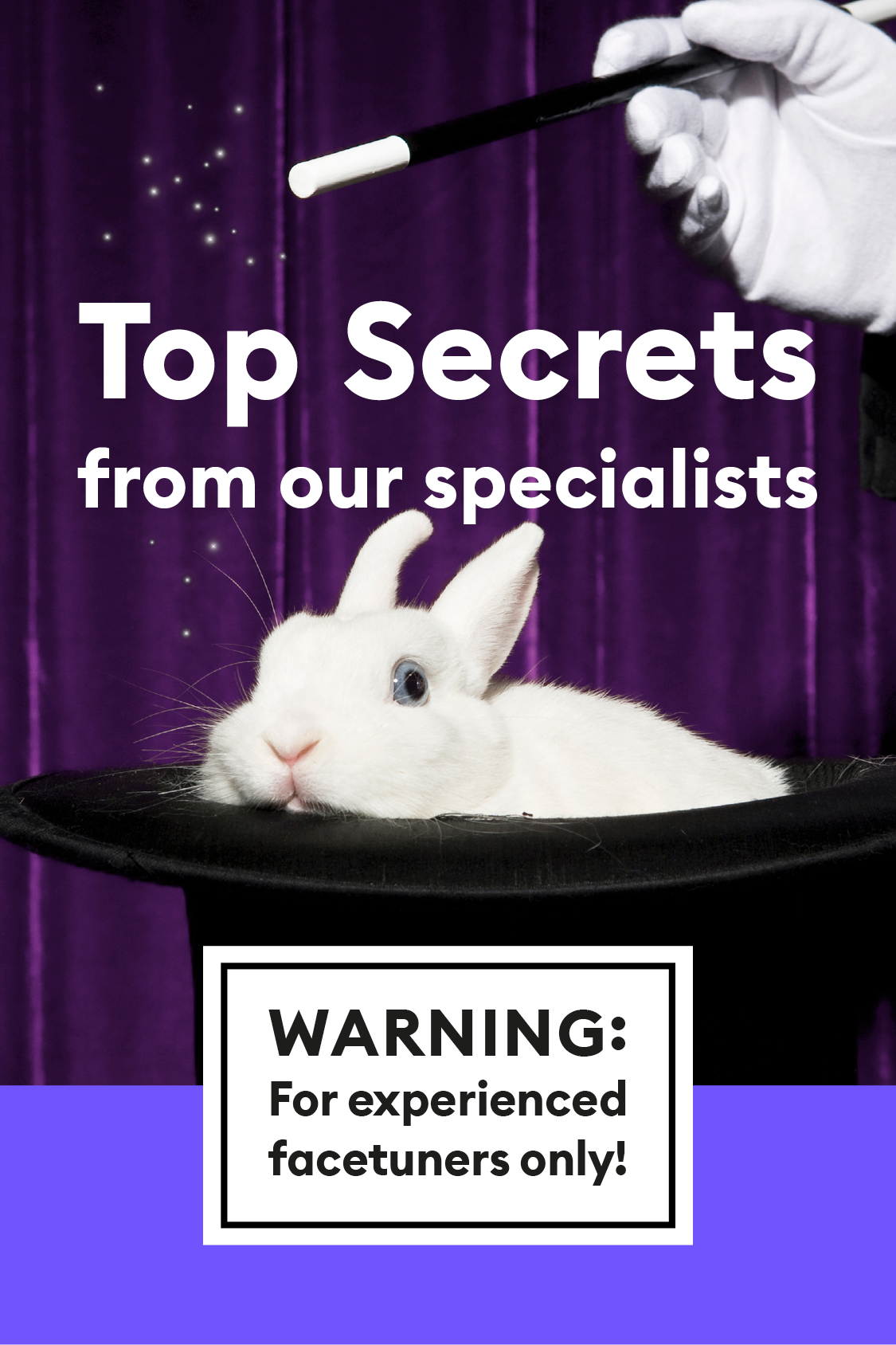
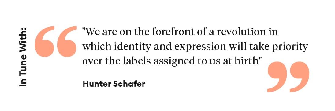
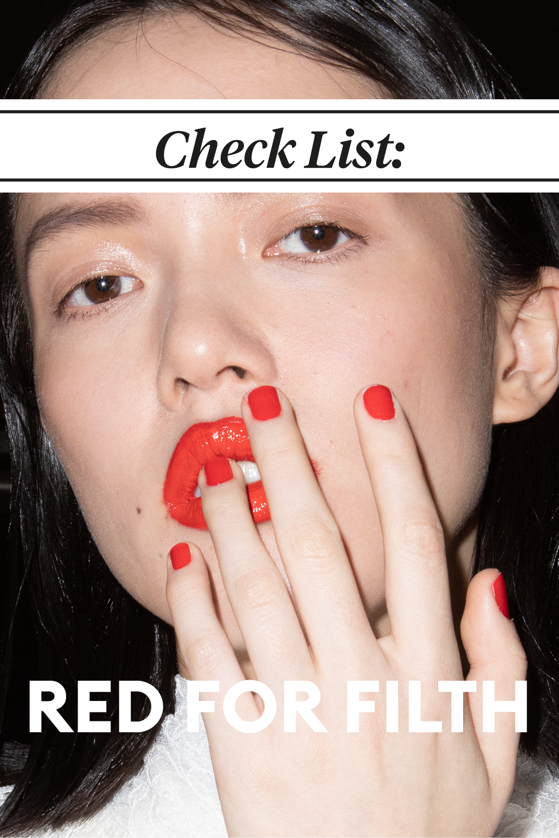
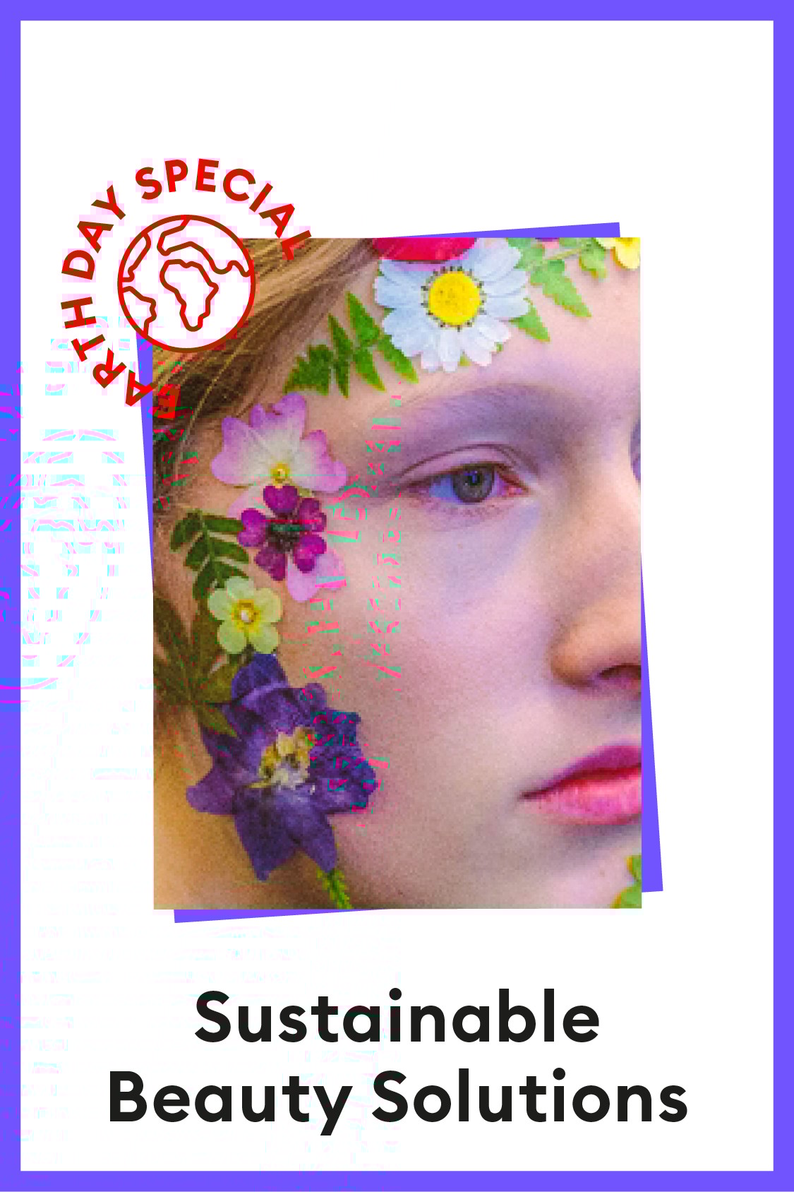
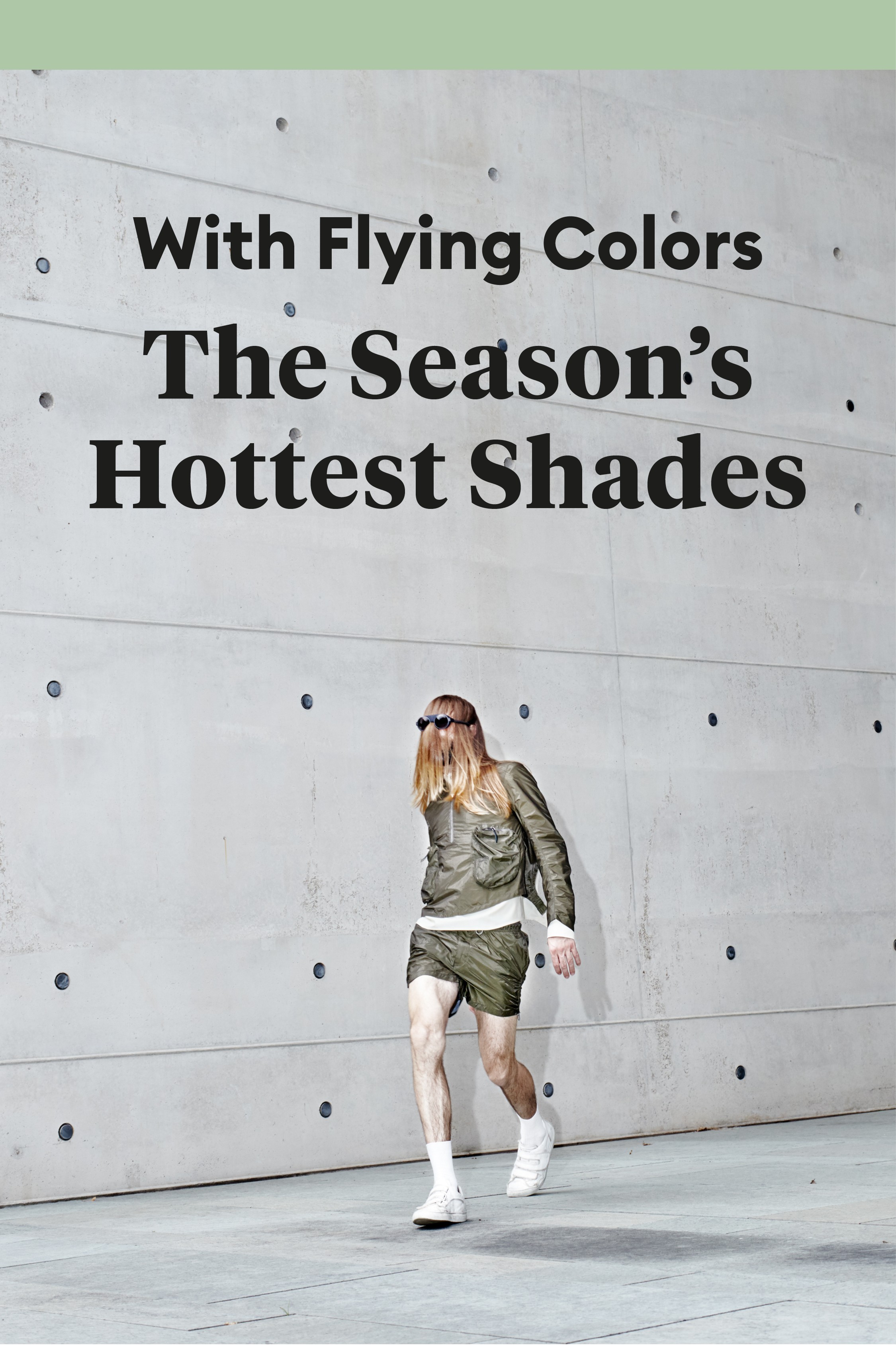
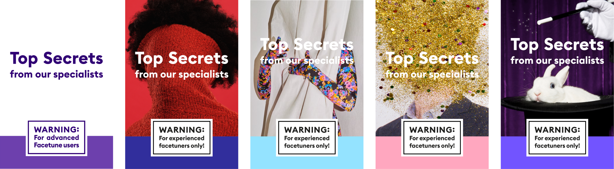
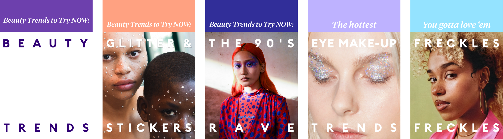
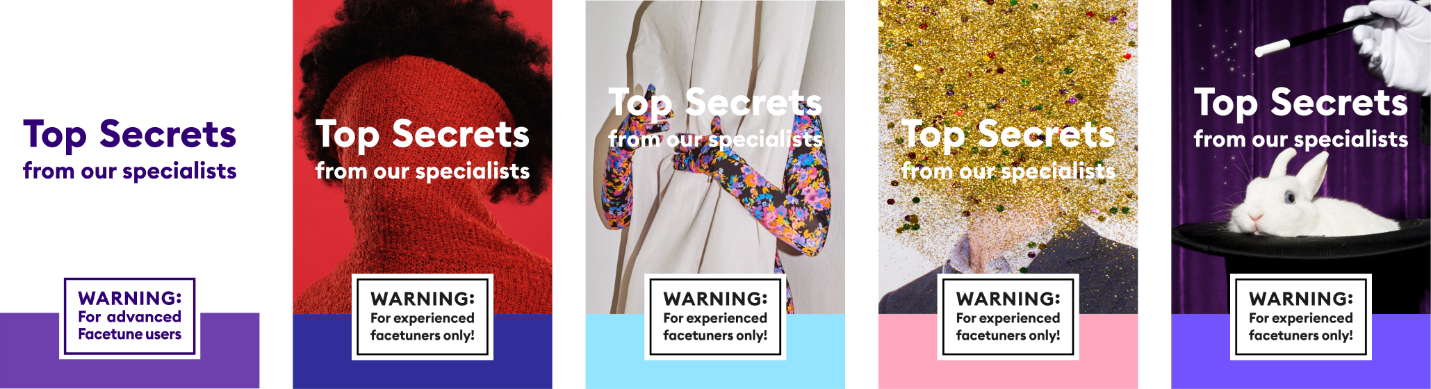
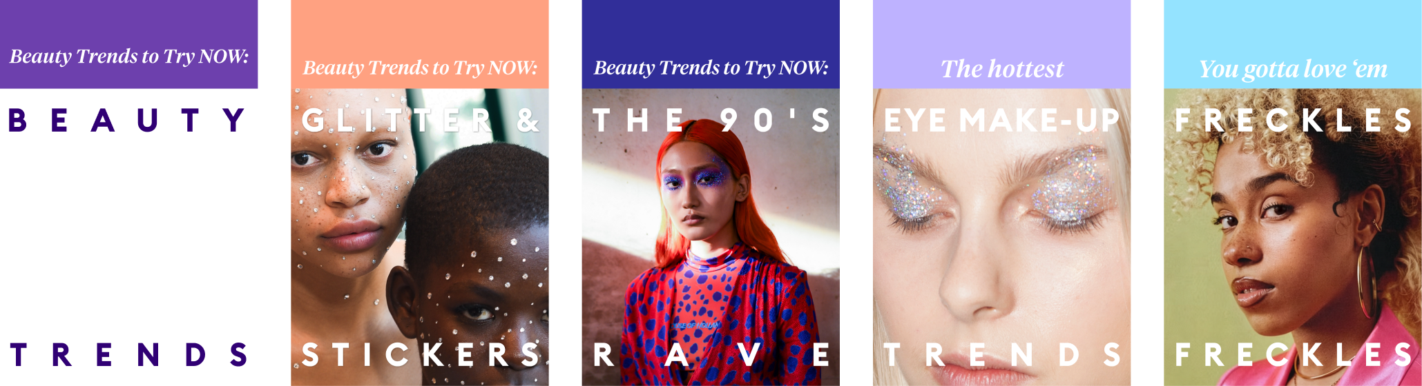
Each content category was defined by a recurring cover structure, with its own grid and typographic language. Imagery and color changed, while the format remained consistent and immediately recognizable.
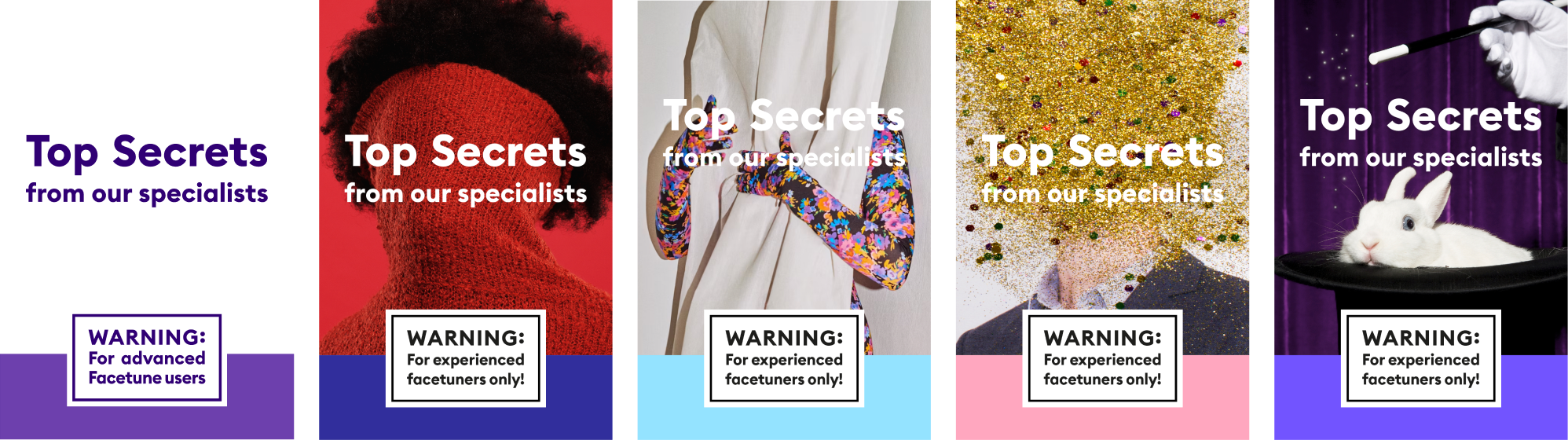

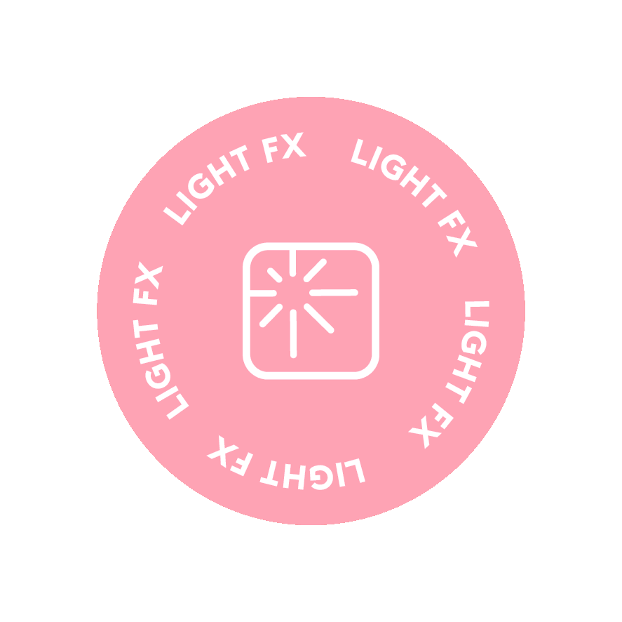
Tool icons were reworked into playful sticker like visuals, used across “tool-tips” content to keep things clear, simple and discoverable.
Color Palette
Golden
Yellow
RGB
HEX
255 233 0
#FFDF00
Winter
Blue
RGB
HEX
157 236 255
#00A54F
Spanish
Violet
RGB
HEX
63 39 138
#44278A
Light
Salmon
RGB
HEX
255 161 129
#FFA181
Green
Pigment
RGB
HEX
0 165 79
#FFDF00
Ruddy
Red
RGB
HEX
157 236 255
#FF0020
Pastel
Magenta
RGB
HEX
255 157 193
#FF9DC1
Lavender
Purple
RGB
HEX
199 187 255
#C7BBFF
The palette adapts easily from bold and energetic to softer, more understated moments giving the magazine room to shift tone without losing its identity.
stay Tuned for more


Tuned
In-App Magazine · Mobile
Tuned is an in-app magazine created for Facetune, a Lightricks app for face retouching and photo enhancement. It’s designed to speak to users who care about aesthetics, trends, and the craft behind their social presence.
Building on Facetune’s reach, the project frames product education through an editorial lens while offering users curated, engaging editorial content with cultural relevance.
Brief
Introduce a cultural and editorial layer within the product, balancing inspiration, storytelling, and product education.
Role
Led the design team, defined the brand strategy and visual identity, and designed the brand mark and logotype.
Outcome
A recognizable editorial framework that integrates content into the product, supporting ongoing engagement and repeat interaction.

Symbol & Logotype
.
Logo
The symbol adapts the original Facetune logo with a fresh, approachable feel. The logotype retains the core brand typeface.
Euclid Circular B
Aa
Aa
The typography system is built around the dialogue between two contrasting typefaces.
A clean sans-serif typeface is used for body text and UI moments, prioritizing clarity and readability while keeping the experience fresh, modern, and accessible.
Tiempos Headline
Aa
Aa
A serif typeface is introduced for headlines and key moments, bringing a subtle magazine sensibility and a sense of character.
Together, the two typefaces create a balanced typographic voice; classic yet contemporary, supporting Tuned’s editorial tone without feeling heavy or formal.
→→→
stay tuned for more


Tool icons were reworked into playful sticker like visuals, used across “tool-tips” content to keep things clear, simple and discoverable.
Color Palette
Golden
Yellow
RGB
HEX
255 233 0
#FFDF00
Winter
Blue
RGB
HEX
157 236 255
#00A54F
Spanish
Violet
RGB
HEX
63 39 138
#44278A
Light
Salmon
RGB
HEX
255 161 129
#FFA181
Green
Pigment
RGB
HEX
0 165 79
#FFDF00
Ruddy
Red
RGB
HEX
157 236 255
#FF0020
Pastel
Magenta
RGB
HEX
255 157 193
#FF9DC1
Lavender
Purple
RGB
HEX
199 187 255
#C7BBFF
The palette adapts easily from bold and energetic to softer, more understated moments giving the magazine room to shift tone without losing its identity.
Formats
Each content category was defined by a recurring cover structure, with its own grid and typographic language. Imagery and color changed, while the format remained consistent and immediately recognizable.
Stay tuned for more


Tuned
In-App Magazine · Mobile
Tuned is an in-app magazine created for Facetune, a Lightricks app for face retouching and photo enhancement. It speaks to users who care about beauty trends, pop culture, and the craft behind successful social presence.
Leveraging Facetune’s reach, the project reframes product education through an editorial lens, positioning Tuned as a cultural layer within the app, combining curated, trend-driven content with opportunities for discovery, habit-building, and deeper engagement.
Brief
Introduce a cultural and editorial layer within the product, balancing inspiration, storytelling, and product education.
Role
Led the design team, defined the brand strategy and visual identity, and designed the brand mark and logotype.
Outcome
A recognizable editorial framework that integrates content into the product, supporting ongoing engagement and repeat interaction.

Symbol & Logotype
The symbol adapts the original Facetune logo with a fresh, approachable feel.
Logo
The symbol adapts the original Facetune logo with a fresh, approachable feel. The logotype retains the core brand typeface.
Euclid Circular B
Aa
Aa
The typography system is built around the dialogue between two contrasting typefaces.
A clean sans-serif typeface is used for body text and UI moments, prioritizing clarity and readability while keeping the experience fresh, modern, and accessible.
Tiempos Headline
Aa
Aa
A serif typeface is introduced for headlines and key moments, bringing a subtle magazine sensibility and a sense of character.
Together, the two typefaces create a balanced typographic voice; classic yet contemporary, supporting Tuned’s editorial tone without feeling heavy or formal.
→→→
stay tuned for more


Tool icons were reworked into playful sticker like visuals, used across “tool-tips” content to keep things clear, simple and discoverable.
Color Palette
Golden
Yellow
RGB
HEX
255 233 0
#FFDF00
Winter
Blue
RGB
HEX
157 236 255
#00A54F
Spanish
Violet
RGB
HEX
63 39 138
#44278A
LightSalmon
RGB
HEX
255 161 129
#FFA181
Green
Pigment
RGB
HEX
0 165 79
#FFDF00
Ruddy Red
RGB
HEX
157 236 255
#FF0020
Pastel
Magenta
RGB
HEX
255 157 193
#FF9DC1
Lavender
Purple
RGB
HEX
199 187 255
#C7BBFF
The palette adapts easily from bold and energetic to softer, more understated moments giving the magazine room to shift tone without losing its identity.
Formats
Each content category was defined by a recurring cover structure, with its own grid and typographic language. Imagery and color changed, while the format remained consistent and immediately recognizable.
Stay tuned for more